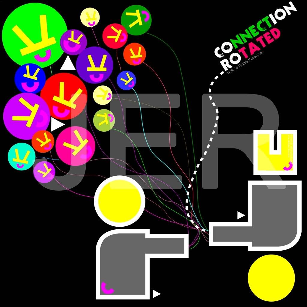
Designer’s Republic’s designs are fun, candy-colored, aesthetic and attractive. I created a design that has colorful colors, using primary and secondary colors. The two human figures are created out of simple shapes, which is improvised from one of the design from Designer’s Republic. Numerous shapes and sizes of balloons are created and the lines are connected to the two figures. The strings are also different colors to emphasize on the cheery mood on the overall. The two triangles are a pair with the human figures because the Designer’s Republic design consists of simple shapes. The logo inside each of the balloons is simplified from the logo of Designer’s Republic. The headline or slogan from each of Designer’s Republic’s work is also very catchy and impactful, therefore my headline for the artwork that I created is, “ connection rotated”. “ Connection Rotated” means the connection to the target market, which in the case, is the two figures at the bottom. The balloons represent the designs of Designer’s Republic. The strings connect the designs to the figures. “Rotated” is used because the figure is rotated upside down and the balloons’ logos are also rotated. This artwork can be seen by all angles. Therefore the name, “ Connection Rotated.” The colors of the headline is also colored in bright colors. The background color is black to emphasize on the contrasts of all the colorful colors. The overall artwork that I created is what I feel Designer’s Republic designs are like, colorful, impactful, fun, aesthetic, and the headline hits with a punch.
No comments:
Post a Comment