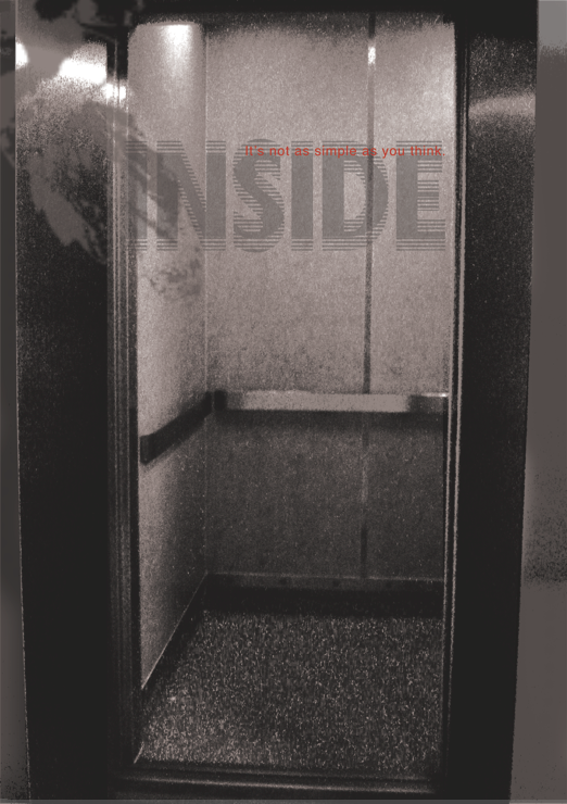
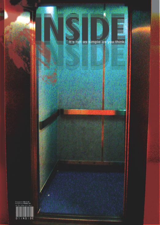
Thursday, September 11, 2008

Design Themed Magazine ( packaging included )

Design Themed Magazine : Inside
Theme : Gloom
Tagline : It's not as simple as you think
Magazine designed with packaging that comes with a complimentary black scissors to cut open the stitchings of the packaging.

The theme of the design magazine is Gloom, therefore the use of dull and dark colours. I experimented and played with the different papers that can be used for a magazine, using transparency as design and printing images on black paper. Therefore the tagline of the magazine is , ' It's not as simple as you think.' Many different explorations has been tried to create this magazine. The packaging is made up of transparent film, stitched together. The binding of the book is also made up of stitches that is seen throughout the magazine and the packaging.

Double page spread : Editors note and butterflies design printed on black paper


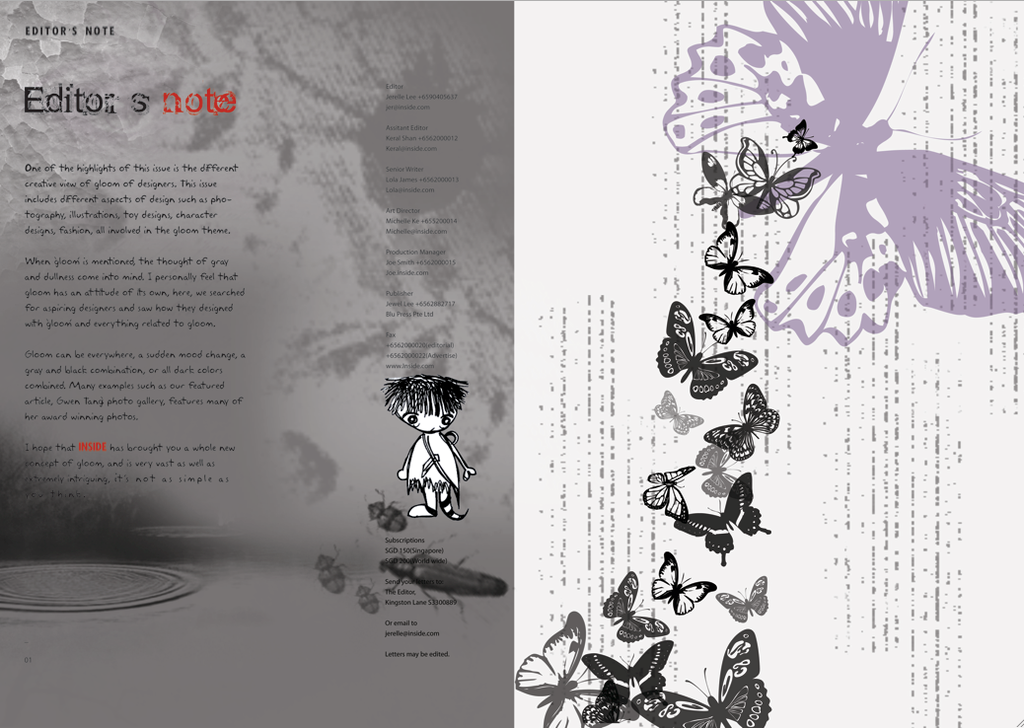
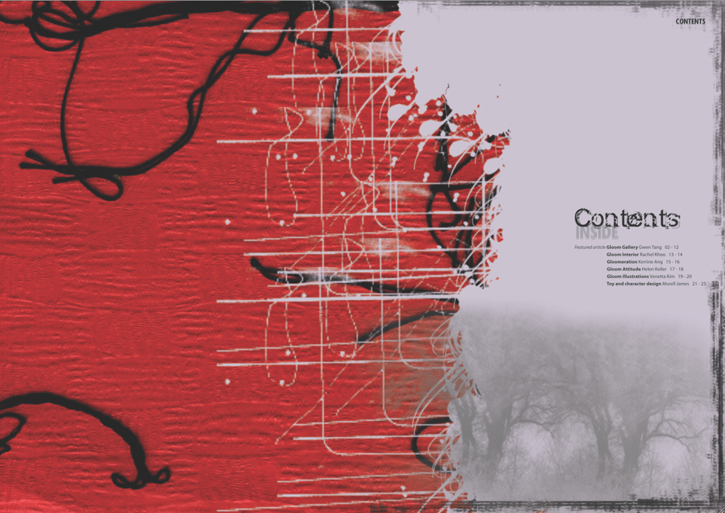
Content Page : Double page spread

Double page spread introducing a renowned photographer


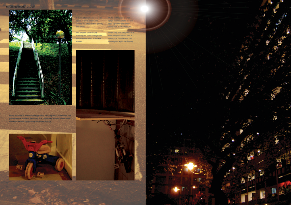
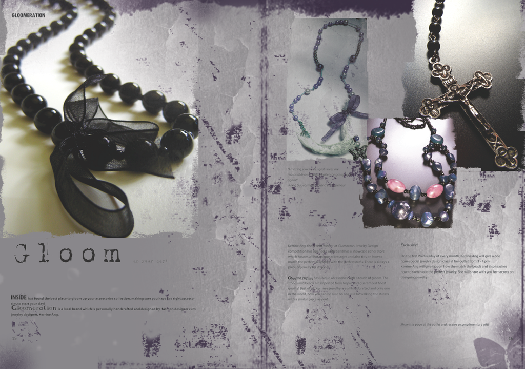
Double page spread of exclusive jewellery pieces

Double page spread : exclusive interview with a renowned illustrator, graphic artist


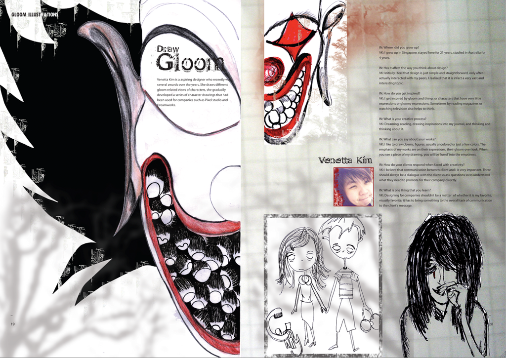
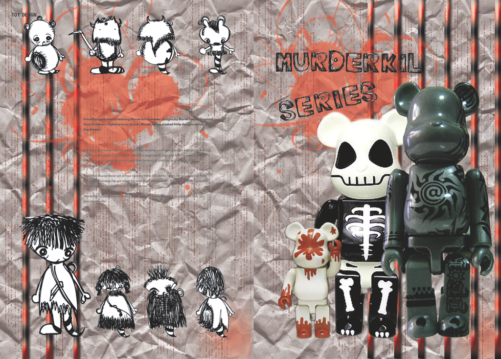
Gatefold - introduction of a new series of character design


Back cover of the design magazine


Monday, September 8, 2008

The Designer's Republic Rebrand

Rebranding for The Designer's Republic

Designer’s Republic’s designs are fun, candy-colored, aesthetic and attractive. I created a design that has colorful colors, using primary and secondary colors. The two human figures are created out of simple shapes, which is improvised from one of the design from Designer’s Republic. Numerous shapes and sizes of balloons are created and the lines are connected to the two figures. The strings are also different colors to emphasize on the cheery mood on the overall. The two triangles are a pair with the human figures because the Designer’s Republic design consists of simple shapes. The logo inside each of the balloons is simplified from the logo of Designer’s Republic. The headline or slogan from each of Designer’s Republic’s work is also very catchy and impactful, therefore my headline for the artwork that I created is, “ connection rotated”. “ Connection Rotated” means the connection to the target market, which in the case, is the two figures at the bottom. The balloons represent the designs of Designer’s Republic. The strings connect the designs to the figures. “Rotated” is used because the figure is rotated upside down and the balloons’ logos are also rotated. This artwork can be seen by all angles. Therefore the name, “ Connection Rotated.” The colors of the headline is also colored in bright colors. The background color is black to emphasize on the contrasts of all the colorful colors. The overall artwork that I created is what I feel Designer’s Republic designs are like, colorful, impactful, fun, aesthetic, and the headline hits with a punch.